Skip to content

Media kit template

Creator Coral

Card-grid dashboard · Aubergine & peach · Montserrat + Inter
The full document

Download the compiled PDF
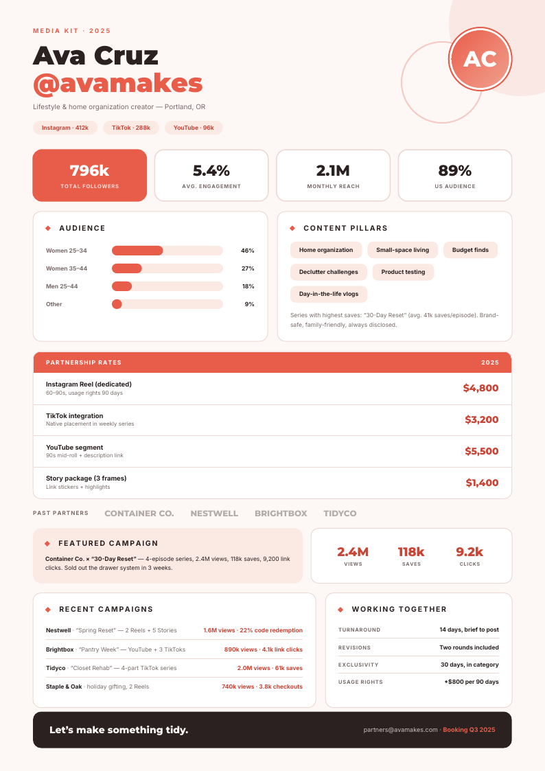
Creator Coral — media kit template, Card-grid dashboard layout, rendered from live data

Rendered by the same engine the API runs — this is the compiled output, not a mock-up.

What happens when your data replaces the sample

What Creator Coral does when the data is longer, shorter or emptier than the sample:

Fixed page furnitureNever grows, never moves
footer rule
Repeats per recordOne block per row of your data
audience bars; content pillar rows; partnership rate rows; past-partner chips; recent-campaign rows; booking terms
Grows with your dataAbsorbs long values without breaking
bio; featured campaign copy; campaign result strings
Pinned to every pageHolds position across page breaks
footer at page bottom
Order on the pageWhat sits after what
content pillars after the audience bars; rate card after the pillars; campaigns and booking terms last
Page breaksWhat may split, what must not
rate rows and campaign rows may split with the header repeating; stat bubbles and the featured panel must not
Last pageHow the document ends
campaigns and booking terms may occupy the final page together

Palette and type

Aubergine & peach

  • Ink #3b2340
  • Accent #e8956f
  • Canvas #faf5f2

Montserrat + Inter

The pairing this design was drawn around, laid out as a Card-grid dashboard on A4 portrait. Either face can be swapped in the editor — the layout holds on the grid, not on a font's metrics.

Other media kit designs

All media kit templates →

Creator Coral is the card-grid dashboard reading of this document; its siblings take it differently — band header and minimal, type-led. See all media kit templates.